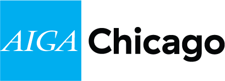
After 8 years, AIGA Chicago debuts a fresh mark with decidedly big shoulders.
Notice something? If you caught the bold dose of blue at the top of AIGA Chicago’s site, you’re already privy to the chapter’s newly unveiled logo. Introduced by Director of Communications Kelly Knaga and Design Chair Brenda Bergen, the lockup is a timely and thoughtful update to the one that’s been in rotation since 2007—when local legend Bart Crosby gave AIGA’s very first graphic (circa 1980) a modern rework.
Playing with scale, placement and color, Bergen and Knaga’s choices point to an evolving sense of self. “The expanded AIGA identity bolsters our existing brand strengths,” AIGA’s national brand team explained, “but it’s also broadening our visual language to emphasize our core attributes and personality.” Those attributes include a certain “big-shouldered” strength and earnest work ethic, captured by the straightforward Haptic, a typeface butting up against the organization’s classic serif initials.
Another juxtaposition: the boxy, two-tone layout. “The new cyan color reflects purity,” Knaga explained. It also conjures some iconic Chicago symbols: “Lake Michigan and the Chicago flag.” Proof that great design begets great design.

